Once you are done with the calculations you can review the results, explore details in the ‘Result Details’ section and add a narrative in the ‘Result Analysis’ section. Let’s explore these functions in detail.
Result Analysis
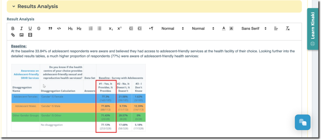
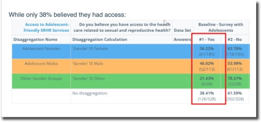
Below the detailed results table is the “Results Analysis” section. This section is where you can add a narrative explanation of the results appearing in your results table. For example, explaining why the number of participants in your trainings is increasing/decreasing over time.
The analysis written here can be added to your reports to add context to the indicator results.
Reviewing Results: Select Data Sets and Type of Results to Display
Once you’ve clicked “Calculate Results”, scroll down to the “Results” section to see the results of your calculation.
Remember: Selecting “Calculate Results” will run the calculation so you can review it in the “Results” section. The calculation will not be saved for this indicator until you select “Save Analysis”. We recommend reviewing the results and if they appear as you wanted, then select “Save Analysis”.
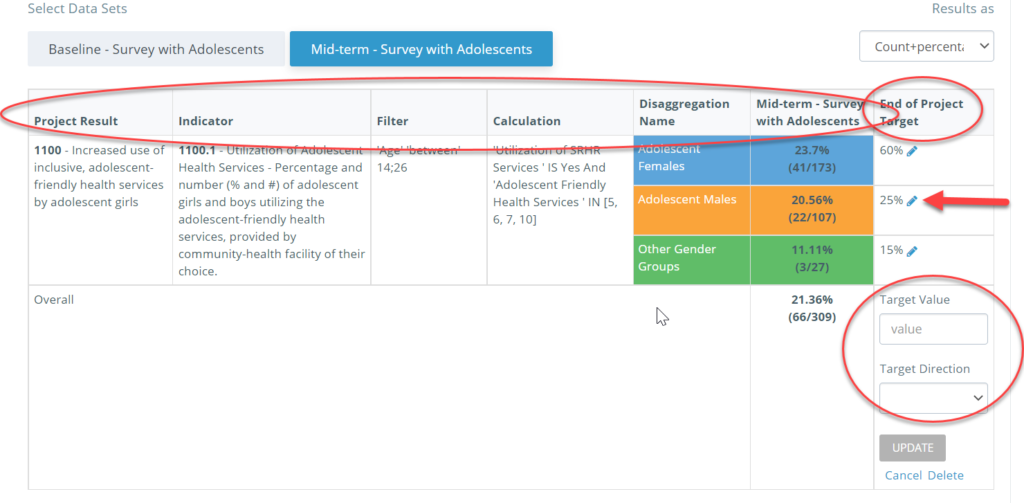
The Project Result the indicator is connected to is included in the table as well as the “Filter” and “Calculation” used. Each disaggregation appears in its own row according to the colours you selected in the section above. If a project target has been set for that indicator, it will appear in the table, or you can create the target.
Selecting Data Sets: You’ll see that the most recent data set is selected by default and the results appear in the table. Click on the other data sets to have them appear in the table as well. To change the order in which the data sets appear, deselect all data sets then select the data sets in the order you want them to appear in the table.

How results are displayed/calculated: For logical calculations the results can be displayed as Count Percentage (shows the percentage result and the fraction), Count (shows the numerator of the fraction only), and Percentage. For a numeric calculation, results can be calculated as Sum, Average, Median, Min and Max. Most often we select “Sum” to see the total number.

If the results do not appear as you expected, revisit your calculation to see if it needs to be adjusted.
Reviewing the different columns will help you identify if you need to go back to a previous step and add or edit anything for your calculations and analysis.
You can also add a “Target” to create a goal for your indicators, in the last column on the right, as shown below.
Note: you have to separately set a target for “View Results as Percentage” and a separate target for “View Results as Count”. Hence, when setting targets you have to be careful about how data is being reported and in what format the results are presented, to avoid any confusion.
You can also set up a direction for the target, which signals the desired direction of the change. For example, if you are looking at malnutrition rates in a population, you will set the direction as “down” because the intended target of the intervention is to reduce the malnutrition rate.
End of project (EOP) targets are what the results are calculated towards and you can set them on the Analyze Data page. You can also set quarterly or annual targets by using custom columns on the Reports page. However, these targets serve as markers or reminders for you, and are not used in calculations (only EOP are). You can read more about creating a Custom Column here.
Kinaki will automatically generate information for your analysis from what you have provided, including simple statistics for your selected data sets, and measurements using a visual graph.
You can change the visual for your responses between a bar or line graph, or a circle (pie) chart, using the “Select Chart” function on the left side of the page.
To export the data or the results from this analysis, choose from the options at the end of the Results tab.
Next, we’ll review the more detailed results tables that appear below this initial results table.
Result Details
If you continue scrolling beyond your initial results table you’ll see the ‘Result Details” tab and under it the icon ‘Explore Details’; click on it to get more detailed results tables.
In the more detailed results table you can see the results shown for each variable in the question used in the calculation.
For numeric questions, you can see the results of different calculations (i.e. Average, Median, Min and Max).

For logical questions it gives you an opportunity to see the results for the other variables in the questions you’ve selected.
